How to configure Ajax Shopping Cart extension
Let’s understand each configuration this module provides and how you can benefit from it.
Store Configurations
Log into your Magento 2 backend and navigate to the below General Options page:
Store → Configurations → Navigate Extension → Ajax Shopping Cart → General Options
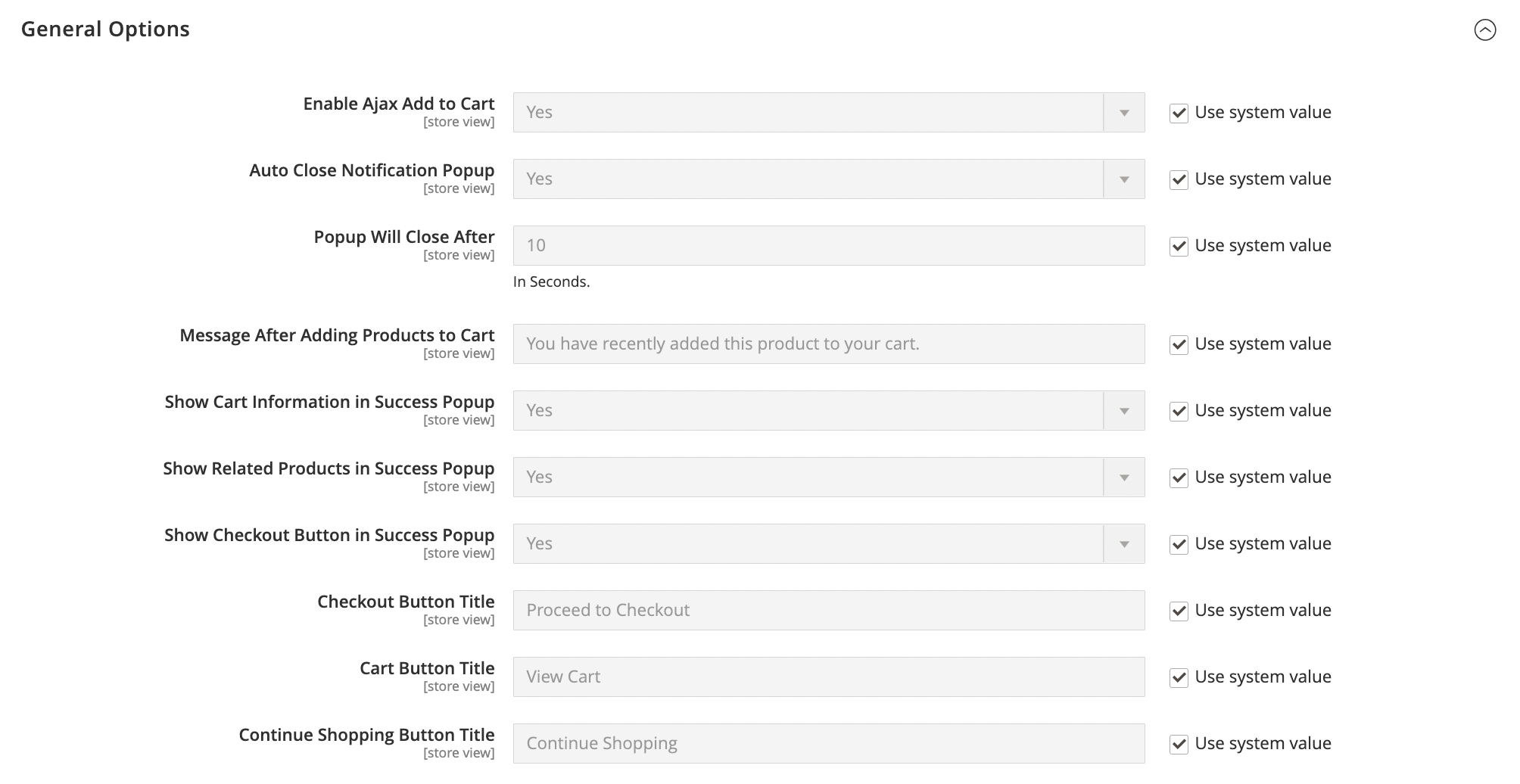
General Options
- Enable Ajax Add to Cart: Select Yes/No from the dropdown to enable/disable this module.
The default value is Yes.
- Auto Close Notification Popup: Select Yes/No from the dropdown to enable/disable this module.
The default value is Yes.
- Popup Will Close After: Enter the time (Enter the time) in the given textbox to keep the Ajax popup visible.
The default value is 10 Seconds.
- Message After Adding Products to Cart: Enter your preferred text message in this box, which will display in the header of the Ajax popup.
The default value is You have recently added this product to your cart.
- Show Cart Information in Success Popup: Select Yes/No from the dropdown to enable/disable this feature.
- Yes: Select this option to show cart information, such as cart total and number of products added to the cart.
- No: Select this option to hide cart information.
The default value is Yes.
- Show Related Products in Success Popup: Select Yes/No from the dropdown to enable/disable this feature.
- Yes: Select this option to show related products in the popup.
- No: Select this option to hide related products in the popup.
The default value is Yes.
- Checkout Button Title: Enter your preferred Checkout button label in this box, which will display at the bottom of the Ajax popup.
The default value is Proceed to Checkout.
- Cart Button Title: Enter your preferred Cart button label in this box, which will display at the bottom of the Ajax popup.
The default value is View Cart.
- Continue Shopping Button Title: Enter your preferred Continue Shopping button label in this box, which will display at the bottom of the Ajax popup.
The default value is Continue Shopping.

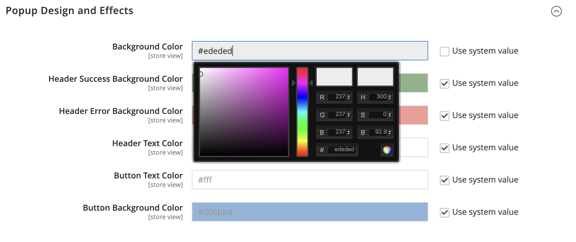
Popup Design and Effects
- Background Color: Enter your preferred hexadecimal code in the given textbox or slide up/down the color slider from the color picker box. Applying this color will change the background color of the popup.
The default value is #ededed.
- Header Success Background Color: Change the error message background color by entering your preferred hexadecimal code in the given textbox or slide up/down the color slider from the color picker box.
The default value is #006400.
- Header Error Background Color: Change the error message background color by entering your preferred hexadecimal code in the given textbox or slide up/down the color slider from the color picker box.
The default value is #e02b27.
- Header Text Color: Change the header text color by entering your preferred hexadecimal code in the given textbox or slide up/down the color slider from the color picker box.
The default value is #fff.
- Button Text Color: Change the button text color by entering your preferred hexadecimal code in the given textbox or slide up/down the color slider from the color picker box.
The default value is #fff.
- Button Background Color: Change the button background color by entering your preferred hexadecimal code in the given textbox or slide up/down the color slider from the color picker box.
The default value is #006bb4.

Last update: 2022-10-01